RED
Red is a physical stimulant that can increase respiration, heart rate and energy levels. It is typically associated with both anger and love. It’s a great accent color for smaller areas such as doors or one wall because it draws attention and brings an element of excitement. If you’re feeling brave, it also works well as a bold wall color.

ORANGE
Orange is a high-energy color with an inherent sense of playfulness. But beware, it can be a polarizing choice – people either love it or hate it. It usually resonates with those known for creativity and individuality. Orange blends well with neutrals and there are many shades you can play with – from pumpkin orange to peach. It’s all about the tone so make sure you test a few swatches before you paint the whole room.

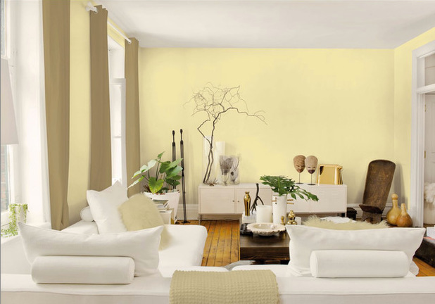
YELLOW
Think optimism and happiness. It’s another energetic color, great for kitchens and gathering areas. It has the ability to evoke memory and imagination. Combined with lavender, it’s thought to have healing powers.
GREEN
Green evokes a sense of calm. Its connection with nature means we associate green with peacefulness and balance. It also has associations with renewal, good health and positive growth. Fun fact: the human eye can see more variations of green than any other color because of our evolutionary history – surrounded by the green in nature, our ancestors had to learn how to detect the smallest changes in the landscape to protect themselves.

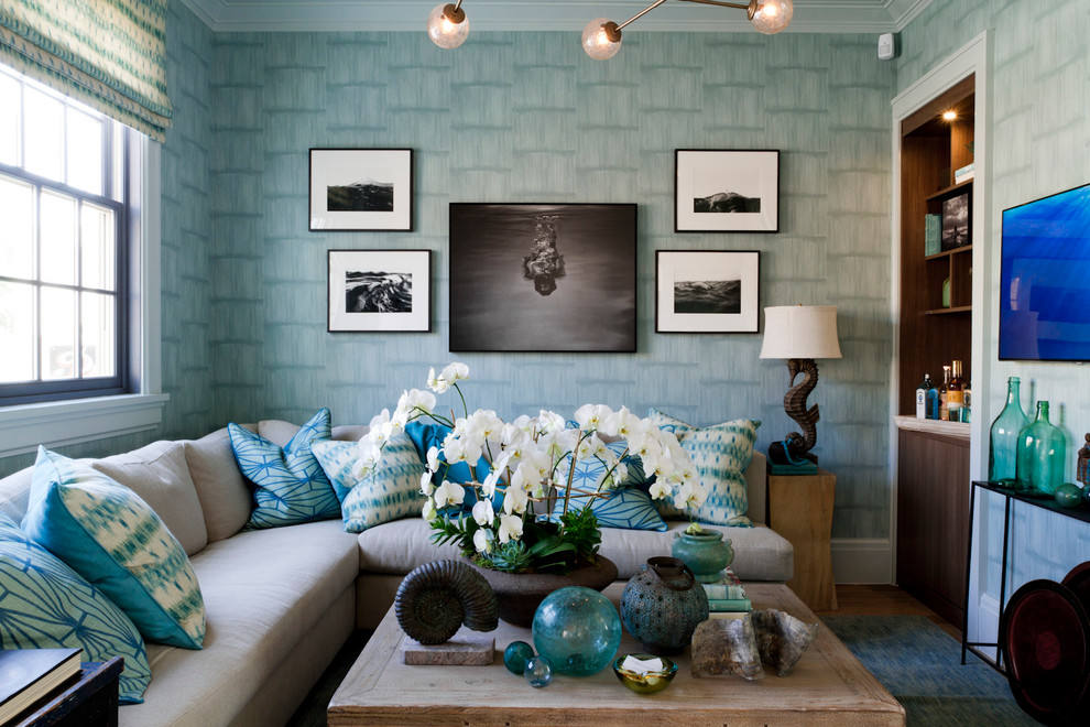
BLUE
An overwhelming favorite, it’s a constant in our lives. There’s a trust factor with blue – which is why many authority figures where blue uniforms and why blue is the most popular color for logos (see above). It slows heartbeat and respiration, emulating calm.
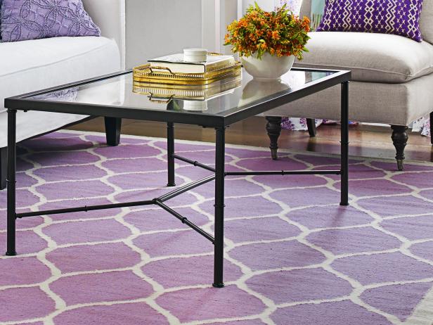
PURPLE
Purple is associated with mystery, royalty and creativity. If you use it in your home, try a shade with blue or red undertones – such a grayish lavender or red violet – these tend to make people feel at ease. True purple can be a bit too abrasive in large doses.
WHITE
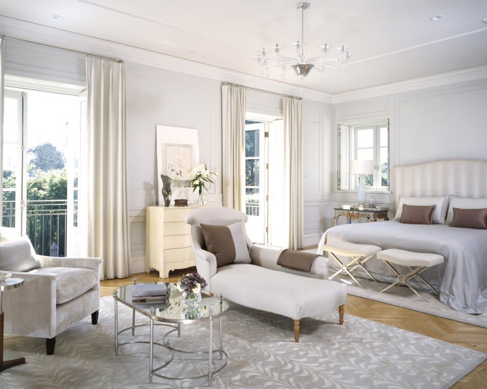
Purity, cleanliness, neutrality and new beginnings are all evoked by white. It’s a positive connotation for most of us but it can come off as sterile and cold. Make sure you pay attention tot eh undertones. If you want just a hint of color, choose a white with blue, pink gray or green undertones.
PINK
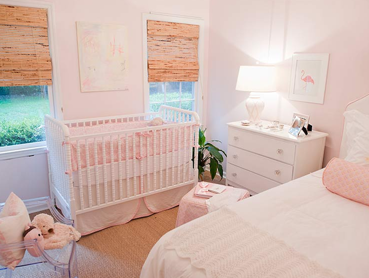
Pink is the excitement of red with the purity of white. It connotes sweetness and romance with a touch of innocence. When mixed with a bit of brown or grey, it can be used as a neutral that conveys calm, stillness and beauty.
BROWN
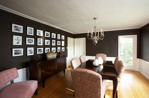
Brown is all about reliability stability and approachability. Warm brown is back, from soft baby browns to dark espresso shades.
GRAY
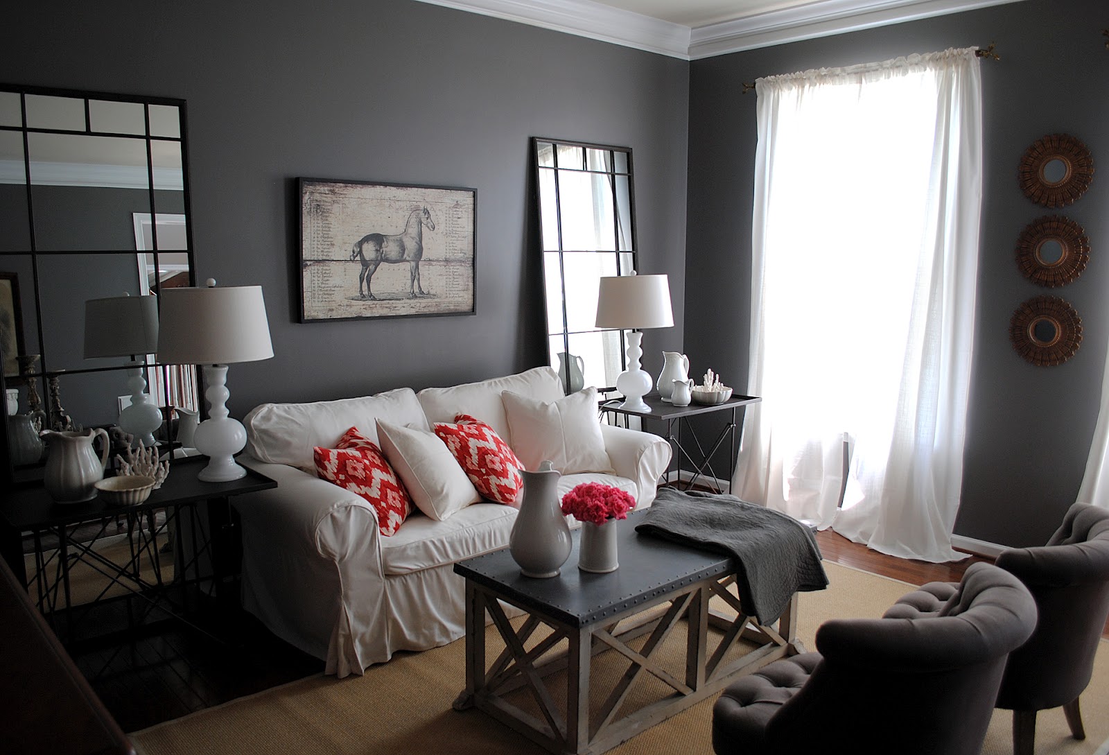
Gray evokes wisdom, intellect and knowledge. It’s a color we instinctively trust. It’s a great choice if you want to push that boundaries but still stay classic and sophisticated. Try a gray with a blue or brown undertone to make the paint job more versatile.
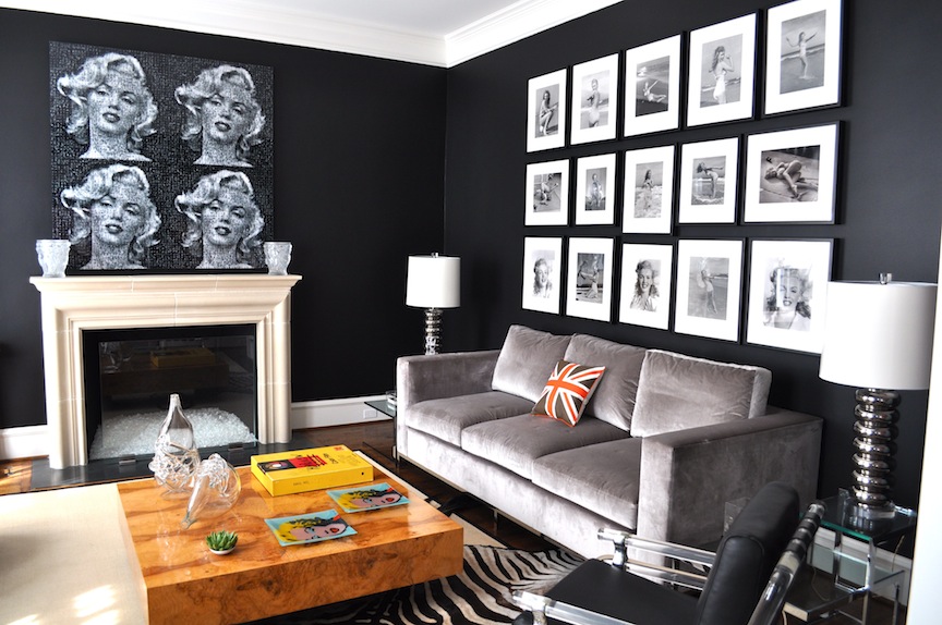
BLACK
People tend to have a strong primal reaction to black. There’s something mysterious and dangerous yet powerful about the color. Either way, people definitely notice it. The lack of color can actually expand your space instead of closing it off, giving it somewhat of an endless quality.